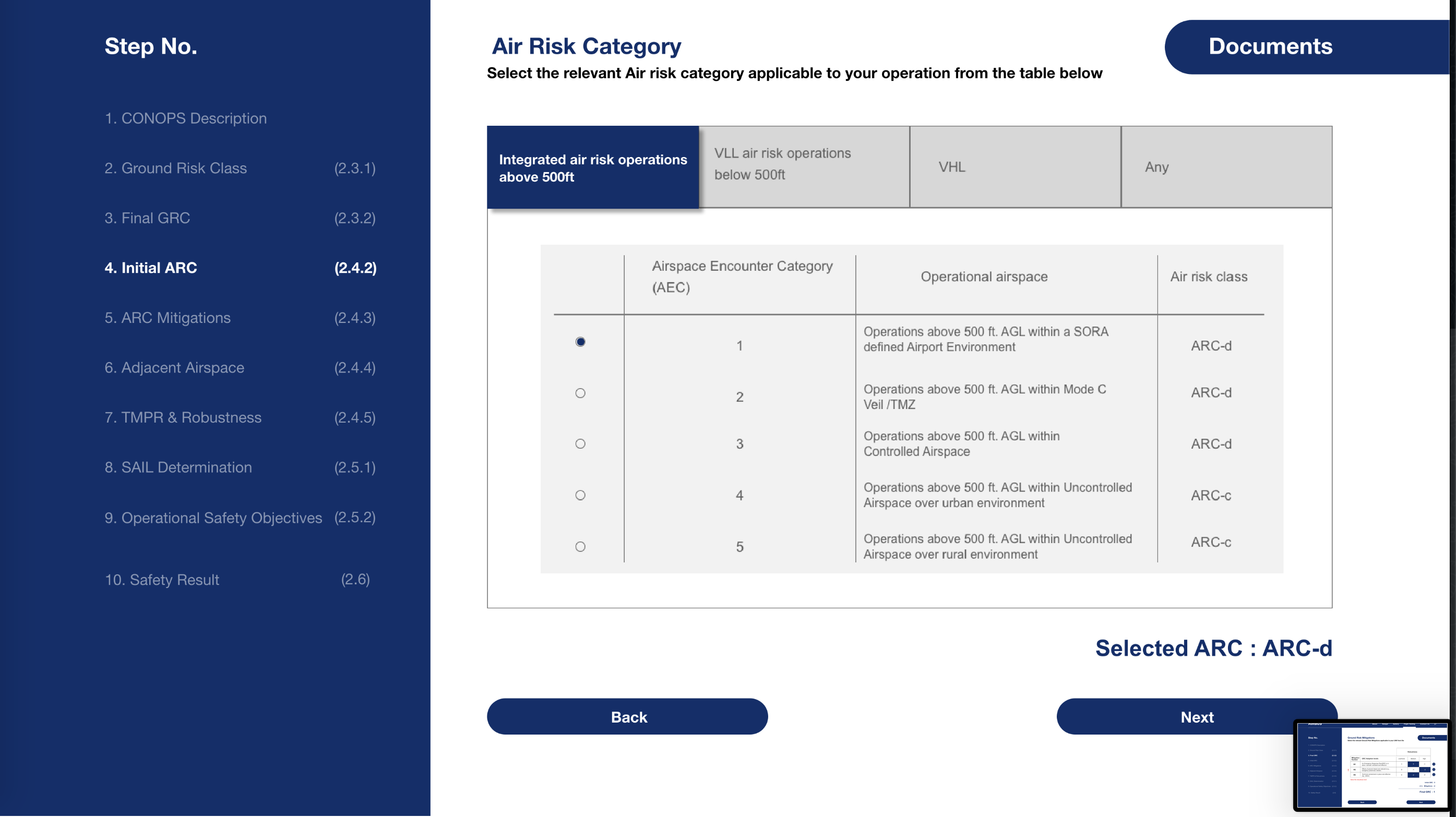
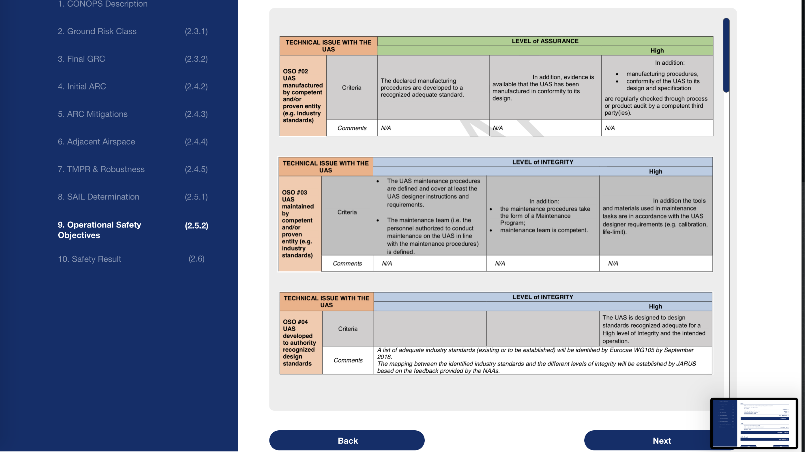
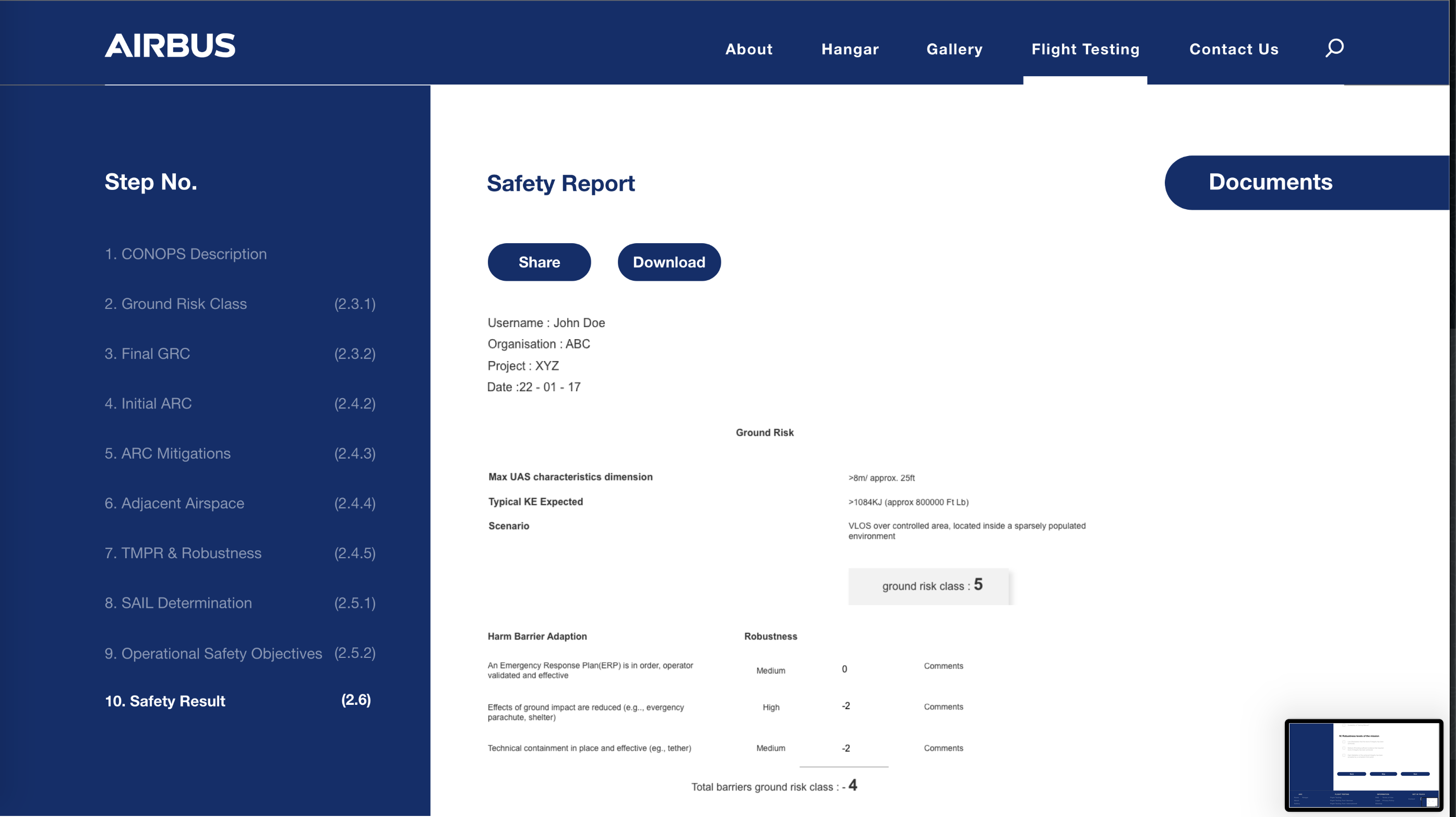
I worked on this project during my time at Pink Lemonade communications. I joined when the project was underway and took it to completion as the lead UX designer. The tool helps users navigate the complex conditions required to obtain a certification of flight readiness. The tool also helps educate users about the various types of certifications.
The brief was to create an automated tool to help simplify the application process for a flight readiness certificate for UAV operators.
On this project I learned how to translate a complicated ask into a simple solution. I also learned how to work with the client in order to refine a product until it meets stakeholder requirements.
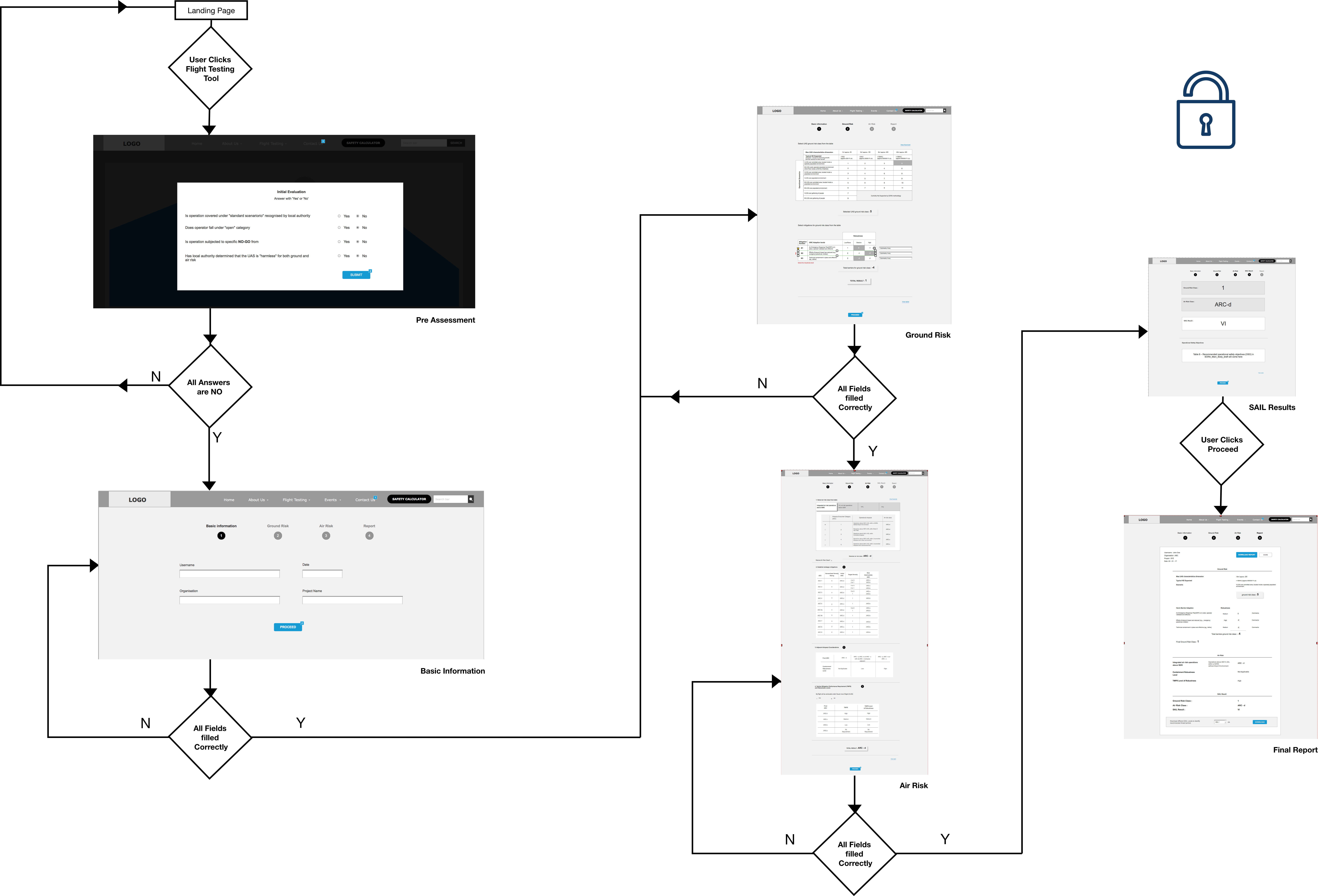
The application logic had to come from an understanding of the manual process as it then worked. This came in the form of JARUS documents. So I first began to read through them to undertstand how a tool like this could work.
After understanding the process I spoke with Subject matter experts to clarify any doubts and try and understand the challenges they had. I understood that there were a lot of annexes to the data in the main JARUS document that needed to be considered and that they were highly conditional.
I spoke with the internal teams at airbus to try and understand what they liked about our current approach (the wireframes developed prior to my joining the project) and what they wanted the final product to be. I understood that there was a requirement for the tool to be both educational and functional.
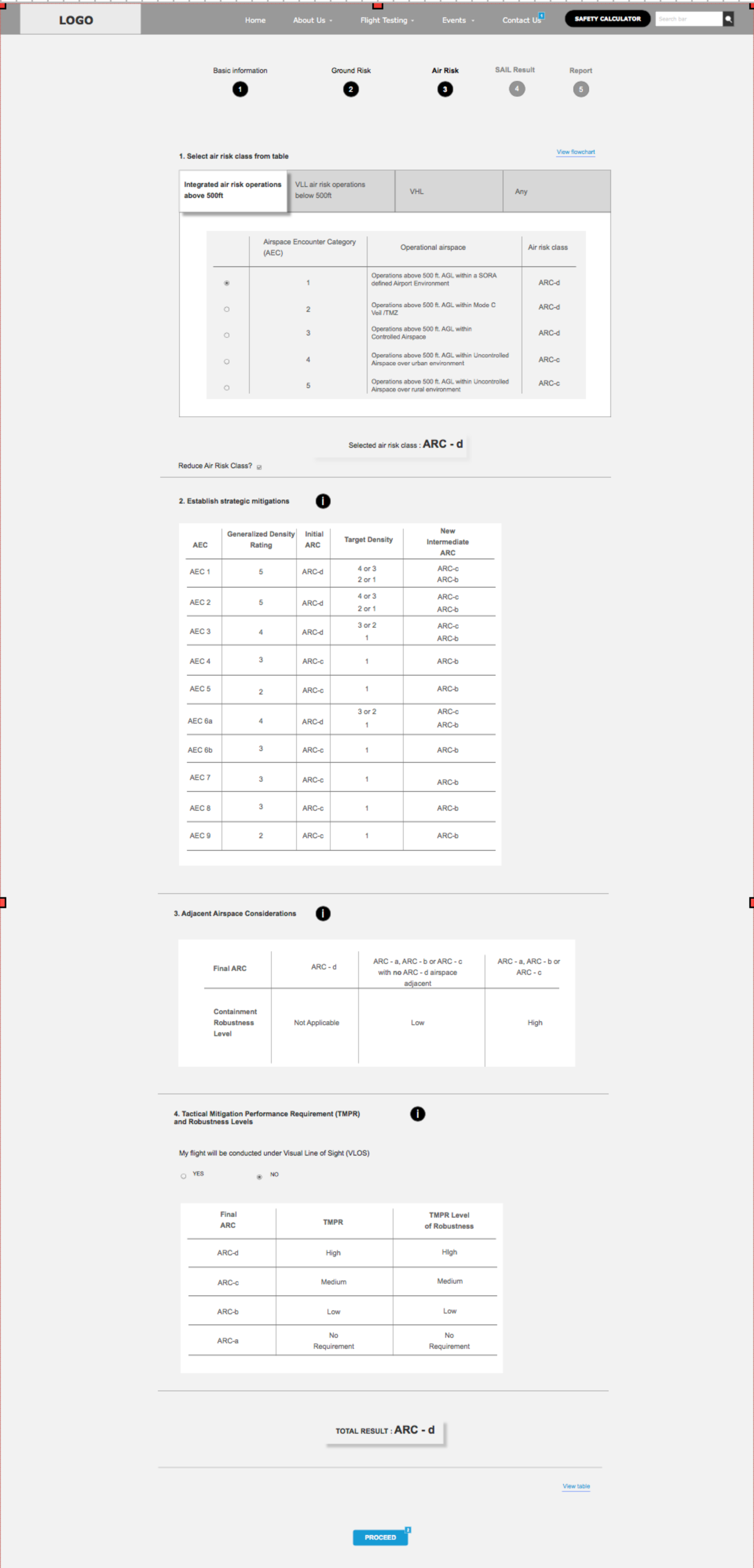
With the knowledge I gained from the SMEs and the Stakeholders i began to redesign the wireframes with more of a focus on surfacing the contextual annexed information when it was required as well as making the wizard flow non linear to allow for users of multiple skill levels to use the tool how they wanted to.
I made a functional prototype and presented it to the client so they understood the new flow and the new functionality. The new approach was approved.
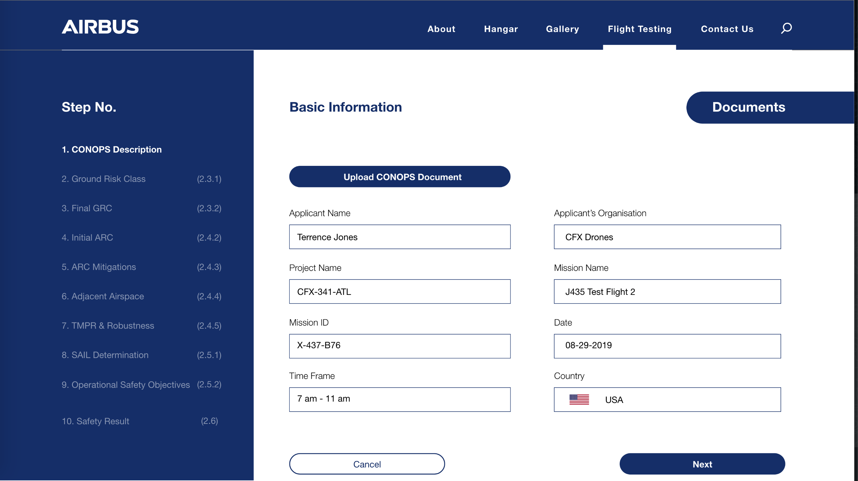
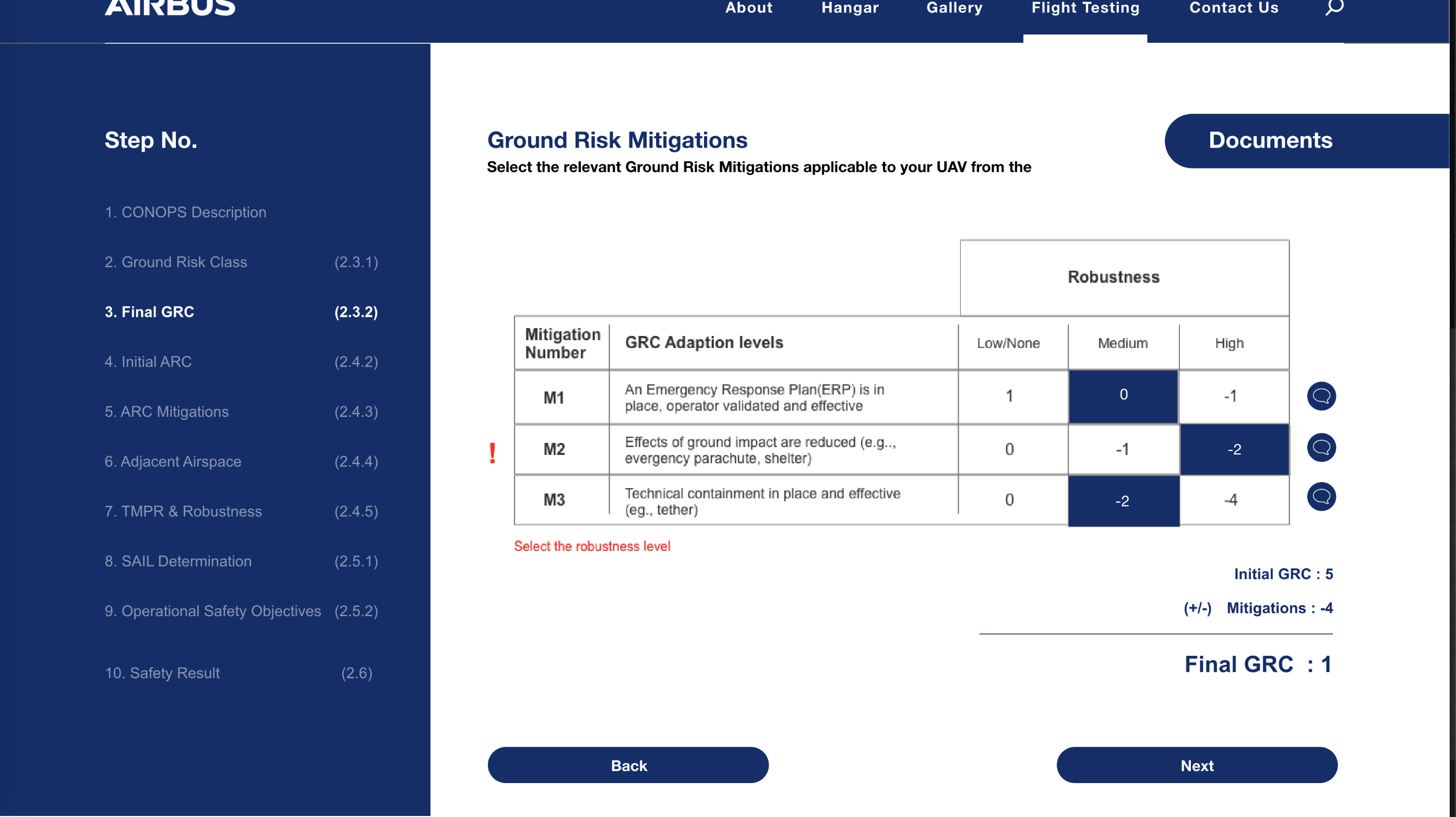
I designed the screens for the application while adhering to the style guide from airbus. I also created an implementation manual for developers to help them understand and code the contextual sections of the application.
We refined our sketches and began to wireframe out the features while tweaking the user flows and the design as we went.
Once we were confident that the app was easy enough for users to use, we finalised the wireframes and documented the interactions.