Overview

Role : UX design, Visual Design

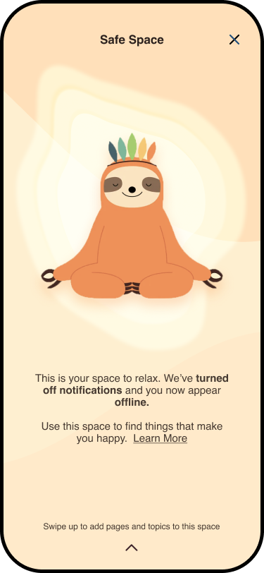
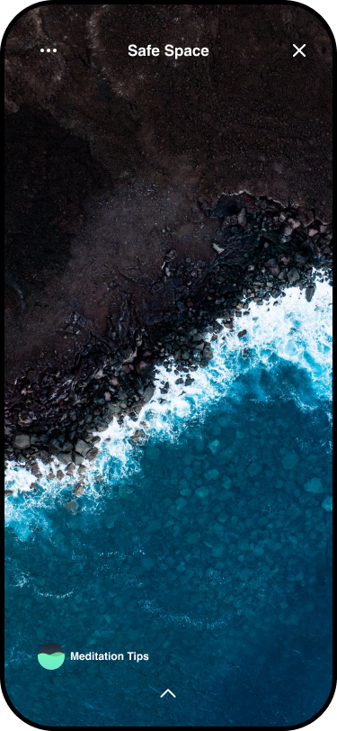
What if instagram had features that promoted mental health? What if they had a place that you could go when the app became overwhelming? This is the premise of Safe Space, a reimagining of instagram that makes it more inclusive.

Type : UX

The Ask

The brief was to assess a current experience, identify the biases involved in it’s design and redesign the experience to be more inclusive.

Mentors : Rajiv Arjan, Lauren Calenza - Google Maps Team

The Process

Learnings

On this project I learned how to be more cognizant of the biases involved in design and how designing for accessibilty improves the experience for all users in the long run.

Qualitative Research

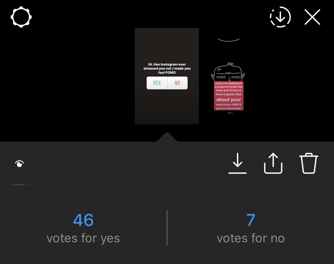
To test my theory I conducted a basic qualitative research study on instagram where I asked a simple question. Has Instagram ever stressed you out / made you feel FOMO.

User Interviews

Of the instagram respondents I reached out to 8 people, some of whom had been dealing with anxiety and some had no mental health issues but still found instagram overwhelming at times.


User Insights

For this project I chose to not create personas in order to solve for the main insights I recieved from my interviews. These were -

  1. A majority of users logged out when they got overwhelmed by instagram
  2. They felt stressed out by constant notifications and DMs
  3. They sometimes felt triggered by certain topics
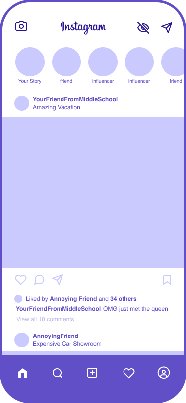
  4. There was a sense that other people were successful and happy which made them feel small

Sketching

I started initially with the idea to have a way to filter out certain people’s posts to avoid FOMO. But after my interviews, I realised that the problem went further than just FOMO. So I sketched out a concept to address the insights I got from users.


Wireframes

The process of sketching led me to various implementation options and after a few iterations I wireframed the concept to try and visualise the user journey.


Visual Design

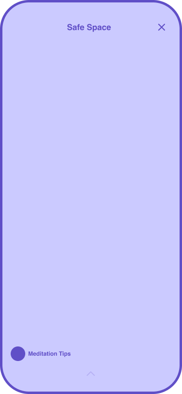
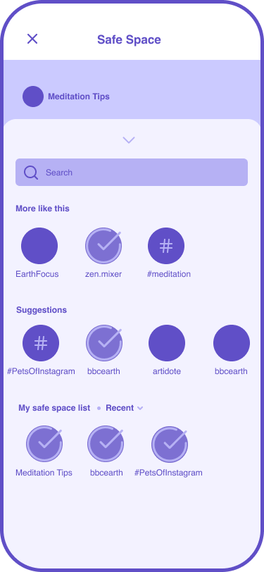
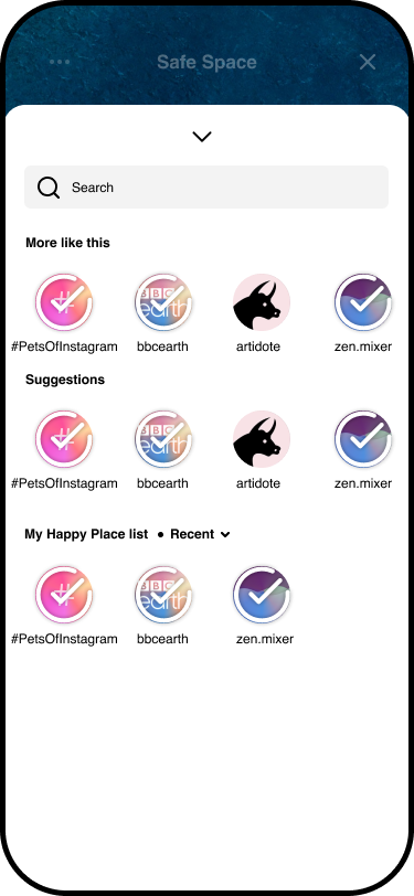
I visually mocked up the core flow for first time users of the happy place feature, how they would add pages, and for returning users I mocked up how it would look like to use and manage their Safe Space.


Low Fidelity Wireframes

We refined our sketches and began to wireframe out the features while tweaking the user flows and the design as we went.


High Fidelity Wireframes

Once we were confident that the app was easy enough for users to use, we finalised the wireframes and documented the interactions.


Annotated Wireframes