Overview

Role : Project Lead, UX design

Foodcoma is an app to find dishes that the locals love and recommend. It makes it super easy to find and order authentic local dishes and community favourites.

Type : UX

The Ask

We recieved a brief from the lonely planet to design an app that would help them capture the growing market of gen z backpackers and millenial travellers.

Mentor: Irene Pereyra, Anton and Irene

The Process

Learnings

On this project I learned how to get to a viable concept from scratch. I learned how to phase out functionalities based on an MVP first approach.

Understanding the Brief

Create a novel experience for gen z backpackers that feels like a lonely planet experience without being another digital guide book


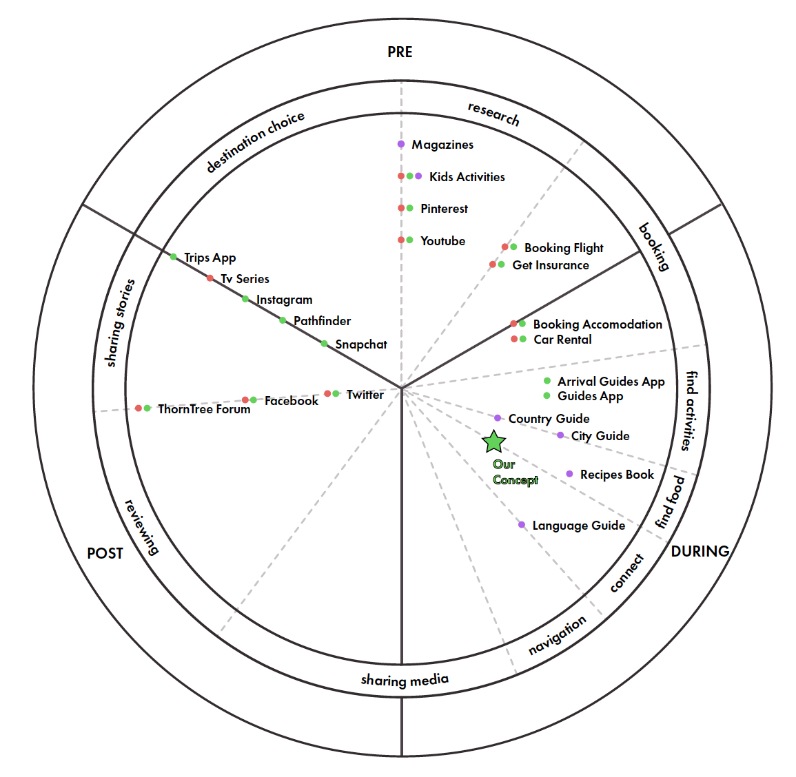
Ecosystem Mapping

We created a map of all LPs products and services and found that while they had products in the food space those products didn’t cater to Gen-z because they were static content.

Stakeholder interviews

We understood that the book was still relevant but to a different audience and hence the decision for a new digital product. The Lonely Planet team was interested in a solution that solved a real problem for Gen Z.


User Interviews

We spoke to 26 Gen Z travellers and found out :

  • - Food is as important as sightseeing on a vacation
  • - Language barriers pose a problem
  • - There are too many restaurant options
  • - They want to try authentic local food

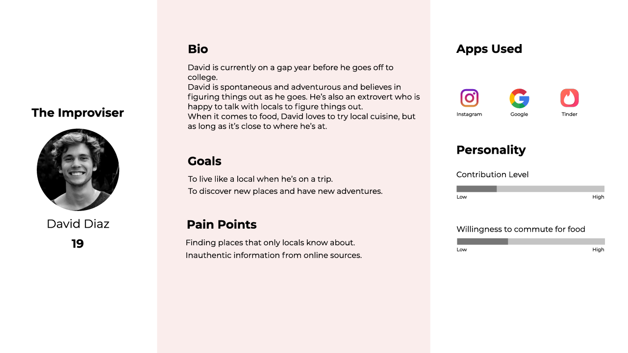
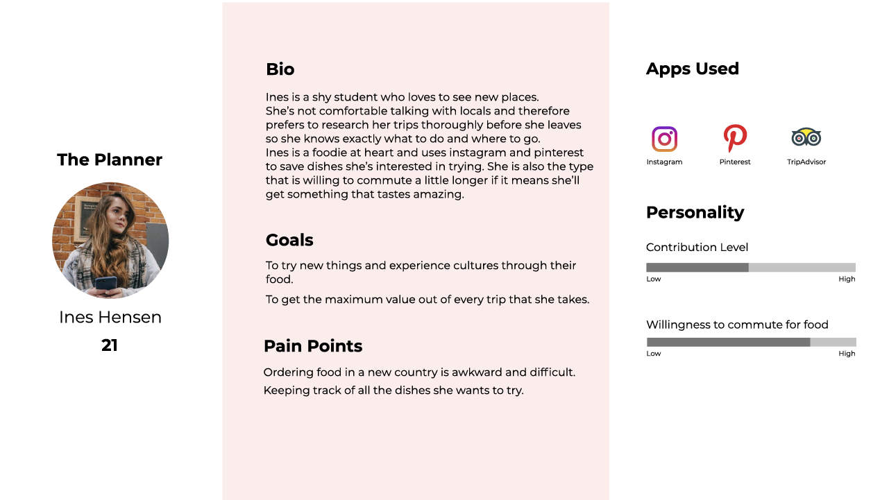
Personas

Speaking with the travellers helped us consolidate their behaviours into our 3 main personas.


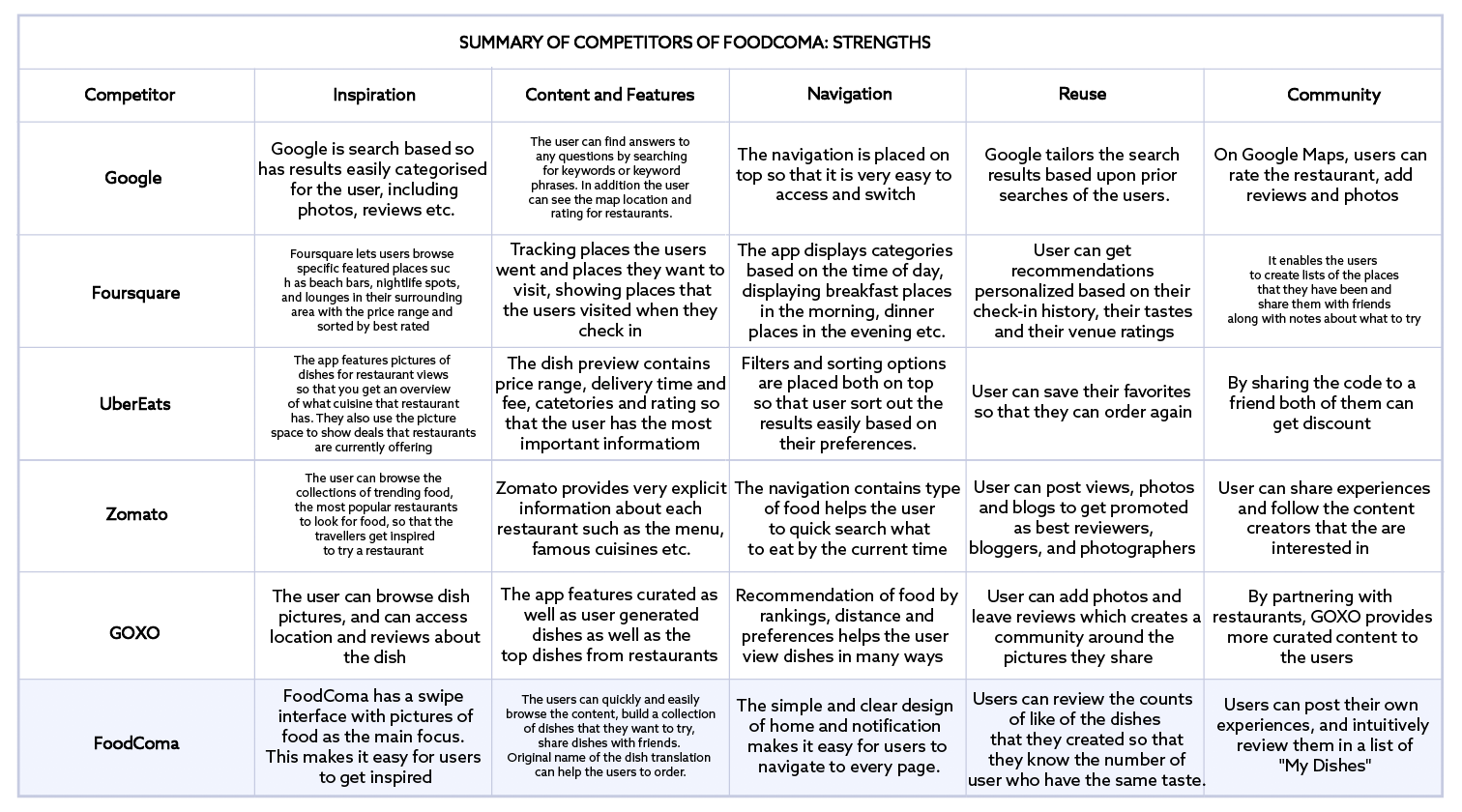
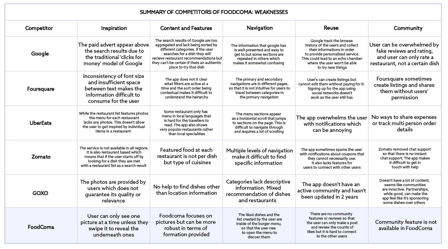
Competitor Analysis

We studied competitors in the food space to try and understand how they handled ordering and seraching for food.


Card Sorting

We asked users to help us categorise content to form the basis of our app architecture.


Sitemap

We iterated over our app architecture until we had the correct mixture of simplicity of navigation while also offering all the features necessary for an application.


Features and functionality

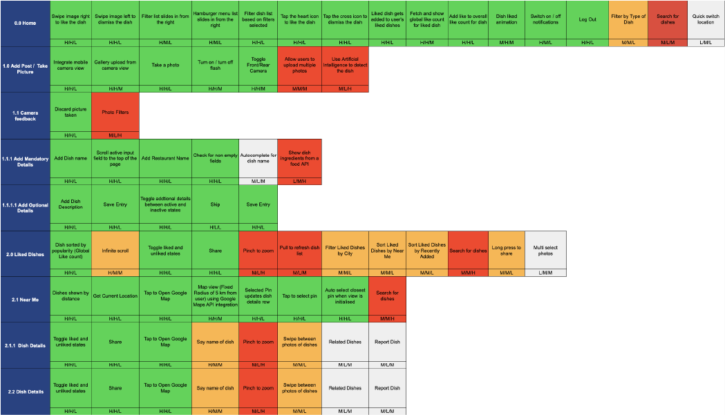
We documented and categorised the features of the application based on their viability and prioritised features that needed to be in the MVP


Sketching

Now that we understood how the application was structred and how it needed to work we began to iterate over how the app could be laid out in design.


User Flows

We picked three main flows to study for the application to make sure that the user’s journey through the app was as simple as possible.


Low Fidelity Wireframes

We refined our sketches and began to wireframe out the features while tweaking the user flows and the design as we went.


High Fidelity Wireframes

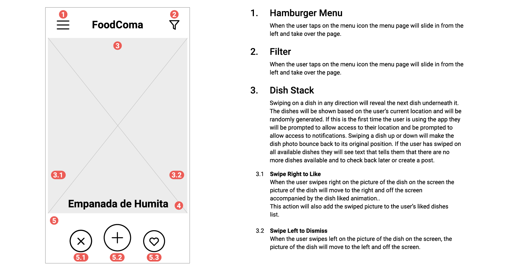
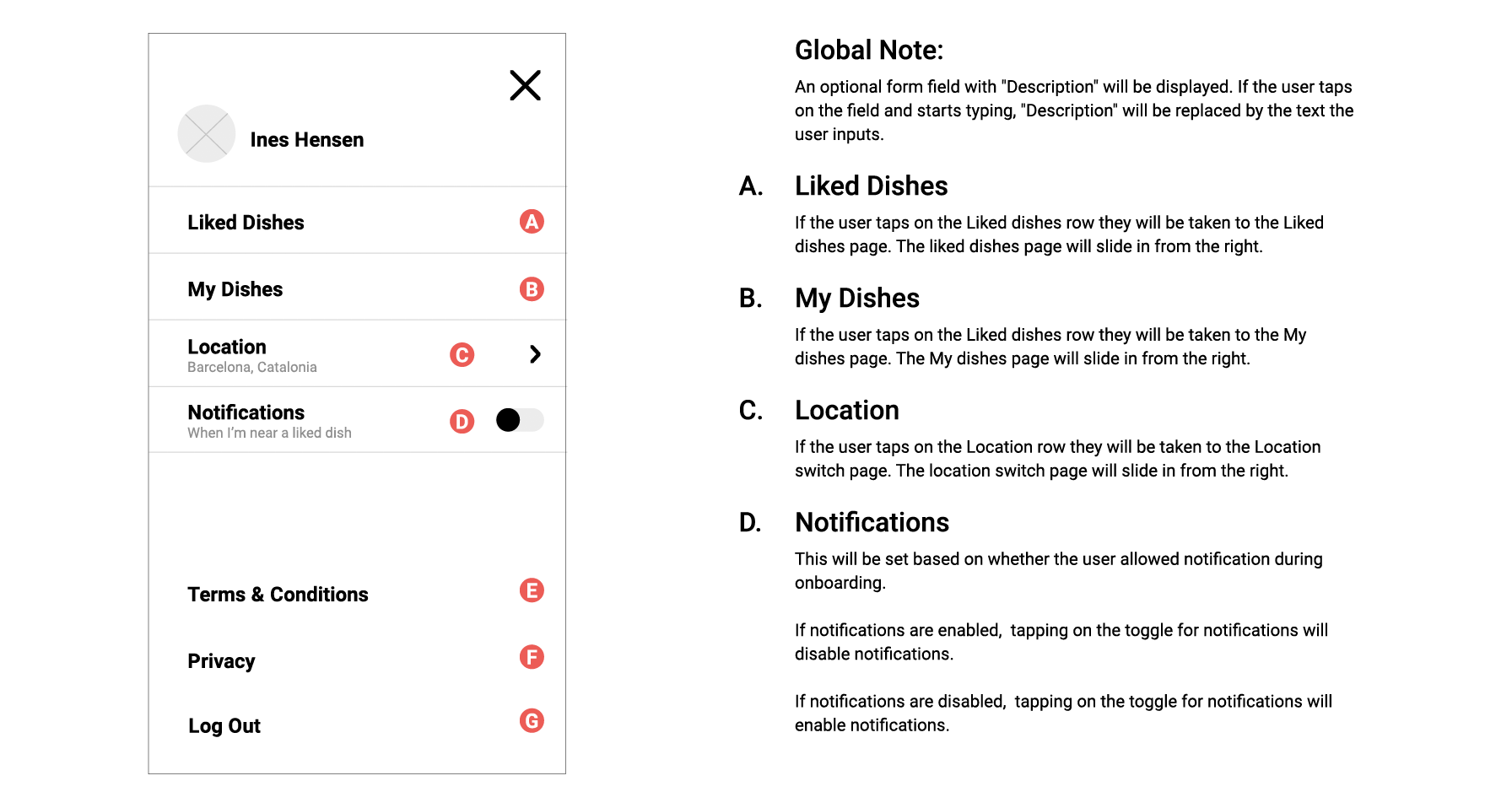
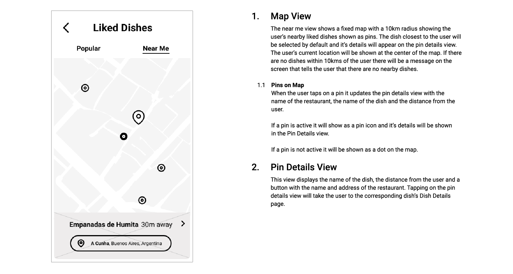
Once we were confident that the app was easy enough for users to use, we finalised the wireframes and documented the interactions.


Annotated Wireframes